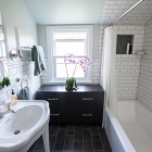
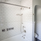
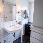
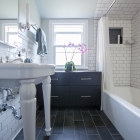
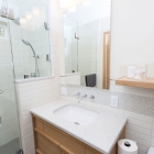
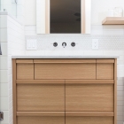
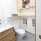
North Portland Bath Remodel
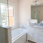
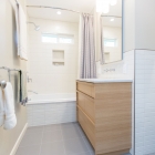
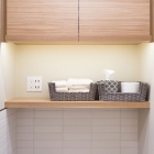
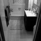
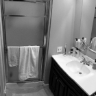
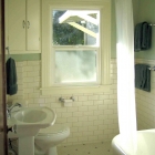
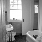
A small, mostly original 1940 bathroom needed to be updated due to failing tile and tired finishes. The goal was to create a period-appropriate, but slightly contemporary space. A light and cool color palette was used with layered lighting for even vanity illumination.
NE Portland 1924 Craftsman
A gut remodel of this classic Portland home allowed updating of every surface and finish. Craftsman-era paint colors, combined with beautiful Heath tile in the kitchen and living room were coordinated for a timeless, but dynamic effect.
“Fritz was a godsend in helping us design the color scheme of our newly renovated home. We were lost and didn’t know where to start. He was able to come in and suggest an overall vision for the house. I liked that he then provided 2-3 recommendations per room, but was also open in telling us which he thought was best. He helped us pick the perfect tile for the countertop we chose. And some of the small additions I didn’t think of in advance provided great value; for example, he chose the perfect grout color to tie in other details from a room that created a wonderful warm feeling. I highly recommend Fritz for your project.”
— Greg and Shana H.
SW Portland Mid-Century Modern Baths
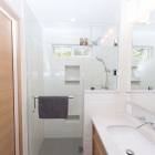
Dark and small original back-to-back bathrooms needed to be desparately updated for this busy family. In order to create air and light, a new window was placed inside the master shower, and all soffitts were removed. A light and natural color palette was used in each, paired with plenty of recessed and surface light, bringing a new brightness to each.
1920s Bathroom Remodel
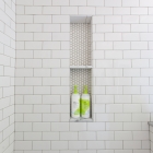
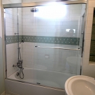
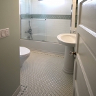
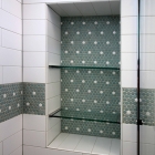
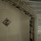
An overwhelming soffit above the shower and previous re-“muddles” had left a dark and oppressive bathroom experience in this young couple’s main floor bath. I was asked to update the finishes and fixtures, keeping in the spirit of the original house, but adding some contemporary flair. The penny tile detail on the floor and in the shower stall and niches, combined with the large scale subway tiles, were employed to lighten, brighten, and modernize this space.
Kitchen Renovation to SW Portland Mid-Century Modern Home
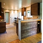
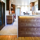
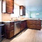
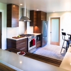
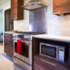
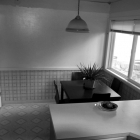
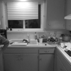
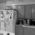
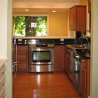
This contemporary kitchen in SW Portland had not been upgraded since its original construction. The homeowners’ request was to open up the kitchen to the dining area to facilitate conversation and improve traffic flow. The rear doorway was moved in order to make better use of the cooking center wall. A neutral and light color palette was used throughout, brightening the east-facing room and optically enlarging the space. ph: J. Florance
Hillsdale Mid-Century Basement Remodel
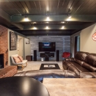
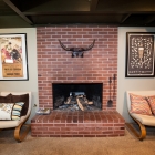
We re-envisioned this previously dark and muddled space to include a media room, office, bedroom, bathroom and separate storage area. New windows, paint, flooring, tile, lighting, wall coverings and furnishings create a dynamic and eclectic environment for working and entertaining guests.
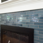
Fireplace Refresh
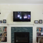
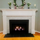
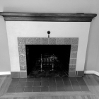
Client requested an updated fireplace surround while adding a sealed gas insert. A combination of slate hearth, marble mosaic tile, and painted wood surround completes the picture.
Shower Renovation to Home in The Columbia Gorge
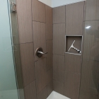
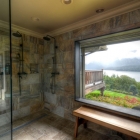
This shower renovation made use of 12×24 porcelain tiles with the look of slate. Oil-rubbed bronze fixtures were added as contrast to further the masculine-centered feel.
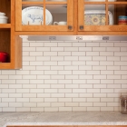
Vancouver Kitchen Tile Design
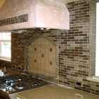
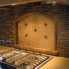
I designed this kitchen tile pattern to reflect the homeowners’ earthy color palette and interest in the Pratt and Larson tile offerings. (Contracted through ProBuild Construction.)
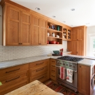
SE Portland Kitchen Renovation
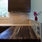
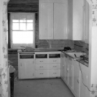
This 1924 bungalow was in dire need of updating for the 21st century. The cabinetry and countertops were beginning to fail, and the kitchen was cut off from a dining area added many years before. I designed this kitchen to open up to the old addition by adding a load-bearing beam and removing the original wall. This allowed for a convenient bar-height ledge and calming kitchen views to the back yard.
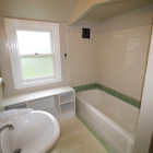
SE Portland Bathroom Renovation
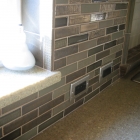
A common, but odd thing for old bungalows is the placement of the bathroom door immediately next to cooking and dining areas. Since this bath already had a primary door from the hall, I closed off the doorway to the kitchen and added period-appropriate, and lighter, subway tiling. A brighter, more roomy and more private bath resulted.
Chicago Condo Kitchen Design—First Prize Winner, NKBA Student Design Competition, 2010 Columbia River Chapter
As Chicago has long been an architectural center in the U.S., I chose to reflect Josef Hoffman’s Viennese aesthetic by using contrasting materials and stressing vertical lines. This design is brought into the 21st century by keeping lines and planes sleek and flush.
The most notable feature of this design are the columns that define the bar space. The passageway from the kitchen to the dining room and the bar counter may be closed during dinner (via sliding panels) to shield the caterers kitchen activity from the diners. When the panels are closed for dinner, internally-lit art niches are revealed in the columns. The columns also function as cabinets for the bar area including Subzero wine cooler, beverage center, Gaggenau coffee center, and bar sink and accoutrements.
Since this space will be heavily used by catering crews, every attempt has been made to create ample passageways for easy movement. The space below the dining table may be used to store stemware trays during bar service.
Dark basalt stone is used on the cooking counter and the backsplash creating a contrast to the light oak cabinetry, cork floor, and carrara marble table and bar tops. Cabinet pulls are cut notches in cabinet doors and the polished nickel Dornbracht hardware continues the contemporary theme.
Since sustainability is a mandate in the city of Chicago and important to these homeowners, materials and products were chosen with attention to their impact on the earth:
• White oak cabinetry that can be sourced locally
• Cork flooring, made from renewable resources
• LED lighting
• EcoRock® by Serious Materials, the only green gypsum drywall
• Low VOC paint
Chicago Condo Master Bath Design, NKBA Student Design Competition 2010
A Japanese Akari lamp served as the inspiration for this master bath remodel.
Since there are no existing windows in this space, I used materials that would reflect and multiply daylight from the surrounding spaces. I strived to create an internally lit “lamp†that would serve as a warm and inviting place to ready the owners for their busy days. Additionally, it would serve as a luminous background for chosen pieces from their Italian art glass collection. To continue the theme of the Japanese lamp, the bathroom colors and surfaces are intentionally kept monochromatic, light, and bright, but also offer rich texture in materials.
The most notable feature of this design are the backlit 3Form® panels in the west-facing walls. This is a secondary ambient light source to clerestory windows and will make great impact at night. These panels contain an organic fiber component sandwiched within, simulating the rice paper lamp when lit.
The fixture shapes are simple and clean, responding to the contemporary architecture of the high-rise building. Chrome fittings matched with point-source lighting create sparkle amongst the other matte materials.
Since sustainability is a mandate in the city of Chicago and important to these homeowners, materials and products were chosen with attention to their impact on the earth:
• Icestone®, a countertop composite of 100% recycled glass and cement binder, is a
Cradle-to-Cradle™ certified product
• Plyboo® bamboo custom cabinetry, made from an endlessly renewable resource
• LED lighting
• Duravit and Geberit low-flow dual-flushing toilet system
• Timers for exhaust fans
• EcoRock® by Serious Materials, the only green gypsum drywall
• Low VOC paint


